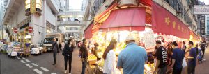
Wide-angle
If the market is divided into street stalls and the ones in the composite building, relative prosperity of the former one is shown with the panorama that distorts street corners to maximize views over pedestrian flow in one single photo.
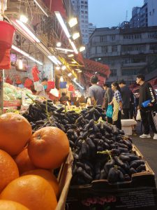
Zoom
Through zooming into fruits pact together, the density among a certain group of objects can be noticed, further to the groups of people, lights and buildings behind. This ultimately creates a harmony of the implied order and crowdedness in the street market.
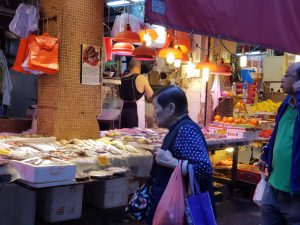
Focus
The posture and facial expression when the woman is seriously choosing what to buy actually show the diversity of goods in the compact market, which goes against the growing standardization in the commercial world nowadays.
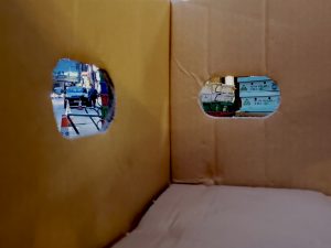
Crop
While the transition from street market to the main road is seeming cropped away by the box, the blockade by containers leftover between the two is implied.
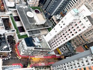
Aerial
Encircled by high-rising buildings, the market is like a compass on a pin plate, which means its land use and features distinctive to this region allows people to circulate/situate themselves accordingly.
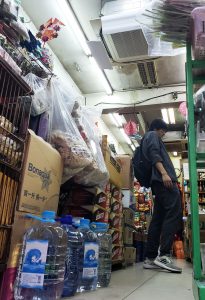
Worm’s eye
From this angle, the shop is overwhelmingly packed with bulky goods, explaining one of the reasons why storekeeper of small street stalls place their goods and conduct transaction outside.
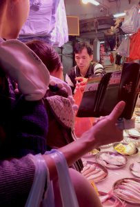
First person view
From the perspective of the woman’s elder son, the significance of the market over residents’ daily life is shown, especially its simple spatial arrangement acting against luxurious consumerism.
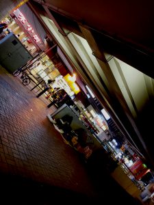
Skewed angle
The alignment of stalls, beams and tiles are presented with hierarchy when the stalls sweep across the photo’s diagonal. This frames the single-storey distinct of the street market within the metropolis.
Perspective
The verticality of buildings amplified the horizontally connective characteristic of the market street as it extends towards the vanishing point.
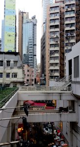
View frame
The stall becomes eye-catching when framed by the escalator which has a dull color and a shielding shape.
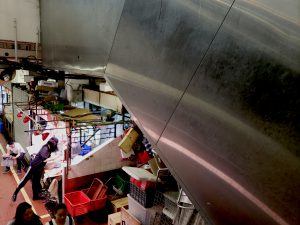
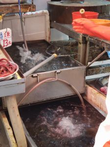
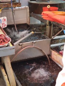
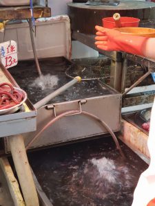
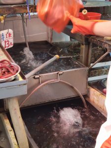
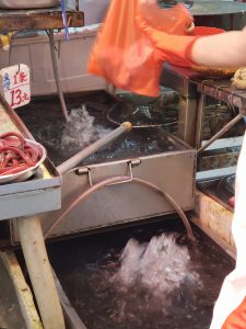
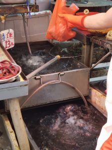
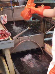
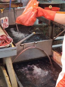
Seriality
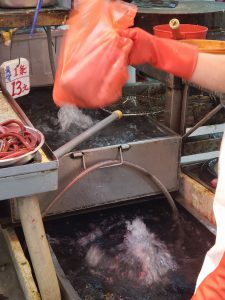
Being the architect of a tiny shop, the owner brings movement and freshness to the front to attract customers.
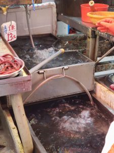
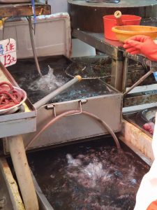

Chiaroscuro
The contrasting colors underscore the boundary between commercial zone and the “swallowed” market.
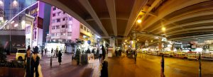
It is all about the context of the street market: The bridge is built after the market and while the commercial hub (purple side) is planned. A clear division of space based on consumption power seems to have expressed by the complementary colors. While the vivid violet imposes the image of vitality in a metropolis, the heartwarming yellow stretching to the street market allows open or even juxtaposing interpretation of it. Whether the geographical differentiation is intentional, it appears to me that every nice bit of the market, from the straight forward aligning structure to self-architected goods or scraps, struggles to counter the dominant formula of commercialization. The market’s humble and diligent qualities make it a down-to-earth gatekeeper of the city.
By Wong Mei Ting, Valerie 3035481239
You have some great shots from the fieldwork! I especially like the Crop Shot in the card box, the First Person View with the branded wallet and the Chiaroscuro shot of bridge between Times Square and the market. The Crop Shot allows to the viewer to escape from the normative human perspective and observe the city through just two different holes, each showing something different. I can see that you have started to develop your own narrative through the photos, but also think about how the composition of the subject matter could emphasize your point. Whether person or object should be in the center or how the objects in the foreground and background should be layered in one photo.