- Wide-Angle
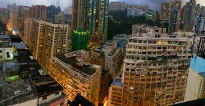
The use of the “panorama” feature accentuates the wide-angle look on this photo and allows the illusion of a “sweeping glance” of the view from the rooftop
2. Zoom
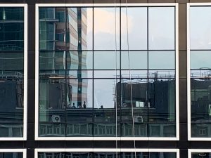
The use of zoom in this photo mimics the technique used in “Infernal Affairs” where the reflection in architecture is used to focus on people.
3. Focus
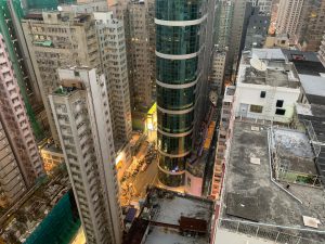
This image places the blue circular building heavily into focus as it differs from the surrounding buildings immensely.
4. Crop
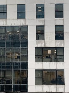
In this image, the “crop” technique was used to highlight office life that can be seen in other buildings.
5. Bird’s Eye

This “Bird’s Eye” view taken from the rooftop shows the unique views that one can get from a HK rooftop.
6. Worm’s Eye
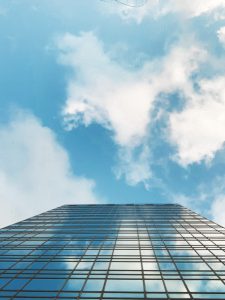
The worm’s eye taken from a rooftop allows us to see element’s of Hong Kong’s skyscrapers merging with the sky. This effect is possible due to the mirrors used in Hong Kong’s architecture. One may think that with the use of mirrors and glass, and the diminishing prevalence of earthy tones in buildings, that Hong Kong’s skyline is beginning to look more artificial and out of place. However, with the use of these materials, Hong Kong’s skyline can often reflect natural skylines and other natural environments of Hong Kong such as bodies of water.
7. First Person’s View

Image showing the machinery found on Hong Kong’s rooftops and how they can only be seen with a “first person’s view” by someone visiting the rooftop.
8. Skewed Angle
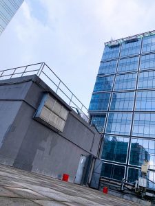
This skewed angle taken from the rooftop provides a new perspective into adding height and dimension to images.
9. Perspective
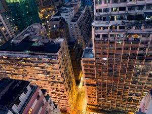
This image allows one to view the light emissions from the street to the buildings in a different perspective.
10. View Frame
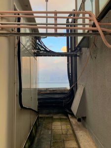
This image shows the rooftop machinery acting as a view frame for Hong Kong’s infamous Harbour Skyline behind it.
11. Seriality
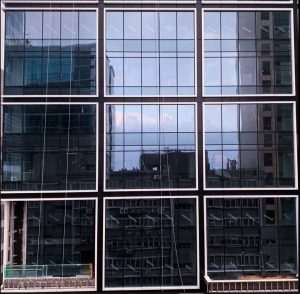
This image shows the repeated patterns that can be seen in Hong Kong’s skyscrapers.
12. Contrast

This image shows the contrast available in Hong Kong’s skylines when you are elevated by a roof, and some buildings begin to fall below this new, elevated horizon.
Sophia Young-Rogers (3035601918)
I like the elevation views such as 2,4,5,7, especially 5, the layers of urban fabrics are flatten well in the image. Avoid generic views perspectives without any focused subjects. Quite clever to use the repeated facade patterns to express seriality. You can try to focus on 1-2 methods / styles / subjects that interests you, to make your set of work stronger.