Neighborhood in Health Crisis
by He Yifu


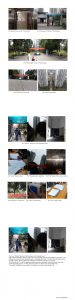
This is my “Seriality” pictures which illustrate a man’s return home.
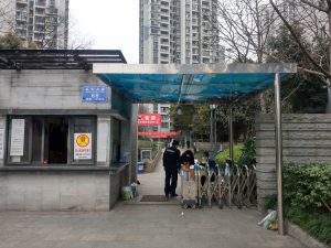
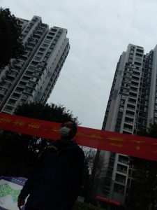
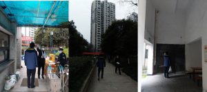
When looked individually, the three pictures show a man standing while the guard taking his temperature, a wan
walking in the sidewalk, a man opening the gate of a building respectively. Yet when looked altogether as the
“Seriality” picture, the three pictures get combined to one and thus could show more details.
In the three photos, we could see guardians taking temperature, pedestrians wearing masks and empty seats
outside the building entrance. All those abnormal “scenes” are details in the current health crisis.
To conclude, Seriality shows more details, which helps to convey the current health crisis.
He Yifu 3035533836
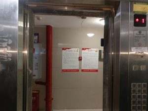
Overall a good attempt to grasp the requirements of the task. Ideas are clearly described in the visuals and writing, although more innovation in thinking through the subjects in your photographs and further improvements in techniques and compositions can be made. Appreciate your use of the elevator to express 2 different but related ideas – as View frame (what do you think is being viewed in this case?) and as your First person’s view. Also like the sequential thinking in the first five photographs until the Seriality shots. Appreciate your thinking that the series of three photographs allow you to include more details in terms of the spaces where the man traverses, as well as the three spaces in sequential order in time. Is there a reason why you stop at three photographs, instead of say, five, to include the elevator and his front door?
In general, the first half of the collection is stronger set than the second (after Seriality) in terms of consistency of subject matter and the setting up of the compositions.
There could be more intentional differentiation between the Zoom and Cropped shots. That they are somewhat similar, though not the same, requires you to establish a position on what one does and who i.e. to think compositionally and what you wish to convey in each case.
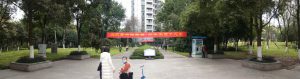
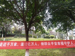
The “Chiaroscuro” Border Tree is intriguing. Took us a while to realize that you are referring to the light and dark provided by the tree canopy yet preventing access by the red banner. Wondering if there is more you wish to convey?