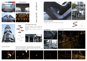
Lippo Centre is designed by an American Architect Paul Rudolph, who is famous for his eccentric using of shapes in architecture. As the head office of a Robot company, futuristic is needed which fit the characteristic of the Lippo Centre quite well.
Gray and blue are the two main colors used in Lippo Centre, with the sense of litmusless and cold tone these two colors are usually happening with science fiction. Logos in the Lippo Centre are mostly in red, and it creates a sense of directivity and efficiency. Light yellow is used for the illumination, which made the architecture not that gloomy.
Symmetry is widely used in the building. The shape of the structure, the mirror created by the material of steel, glass, and water make it melodious and smooth which is also very modern.
The circulation inside and outside the Centre is also quite fancy. Interaction created by the monumental staircases, the pedestrian footbridge, as well as the interleaved roads surround the Lippo Centre create scenes for stories to happen.
The last thing that interests me the most is the light effect. One of the light types has a shape of alien, which is very interesting in the deep dark. The architect put the light under the stairs, in front of the water, also borrow light of other buildings by the mirror like the facade, which create a dramatic scene at night.